MKBHD logo animation | Step by step SVG and CSS tutorial
Step-by-step tutorial - MKBHD animated loading animation with SVG and CSS
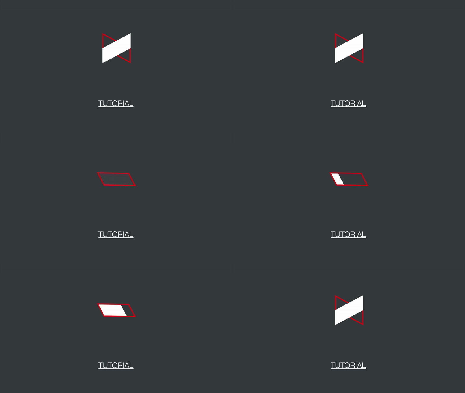
In this post I'll walk through the steps taken to create an animated loading animation in CSS and SVG for MKBHD, or Marques Brownlee. I've been following Marques on YouTube for years. His tech reviews are top notch, and his passion for high quality videos is obvious in every upload. If you don't already subscribe to his channel, go do that now, you won't regret it. For this tutorial, I've included the steps to take in Sketch too since a lot of you were asking for it. Let me know if this is something you'd like to see more of though. :)
I originally posted the animation on Twitter and didn't expect much, until the man himself saw it, replied, and retweeted it. The response was incredible and I'm really greatful. Marques if you're reading this, thank you!
if @MKBHD had a loading animation. Had a lot of fun with this, the logo lends itself well to flipping itself into a sort of progress bar. Different version for undetermined loading in the blog post https://t.co/z9Rj54iAhl #CSS #webdev #animation pic.twitter.com/jWfAYtsiQd
— Chris Dermody (@cderm) April 7, 2018
Creating the SVG graphic in Sketch
NB: Click here if you want to skip the actual graphic part of this tutorial and get straight to the code part where we'll animate the logo with some buttery smooth 60FPS CSS animations.
I create all my vector graphics in Sketch. I find it's really great for these types of projects. It's not free, but it has a free trial so you can try it out at no cost. I'm not an affilliate of theirs, but I really should be :D.
To get started, create a new Artboard. Hit "A" on your keyboard and drag a new artboard across the screen.
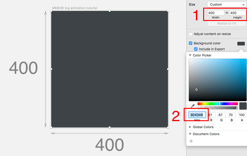
Make the artboard a square shape, 400x400 (1). I find this size works best for most of my loading animation projects. I've also gone ahead and color-picked the dark grey from MKBHD's logo and made the artboard background that colour, 3D4346 (2).
Next, we'll start drawing the actual logo. For the purposes of this animation, I've broken the logo out into 3 pieces.
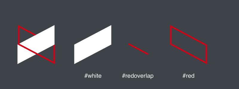
The #white element sits on top of the #red element in terms of order. Then the #redoverlap element sits on top of them all to achieve the visual effect of one element slotting through the other.
To make the polygon shapes you can use the Rectangle tool and then free transform the element so that it skews to the right angle. Protip: screenshot the logo and trace over it so you get it as close as possible to the real thing.
The final thing we need to do in Sketch is to add the four white progress bar segments that gradually appear as the animation progresses.
To make them, I simply rotated the #red element so that it was level. For me this was about -28 degrees.

I then filled that shape with four equally sized polygons, making sure that they were seated behind the red outer shape.
We're almost finished with Sketch, but first we need to make sure our layers are named appropriately. This makes our lives easier later when we're targeting certain elements with CSS.
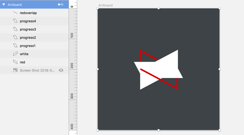
I named my layers in a way that made sense to me. You can make them whatever makes sense to you, but you'll be referencing those names in the code later so make them easy :)
Next step is to export our creation as SVG.
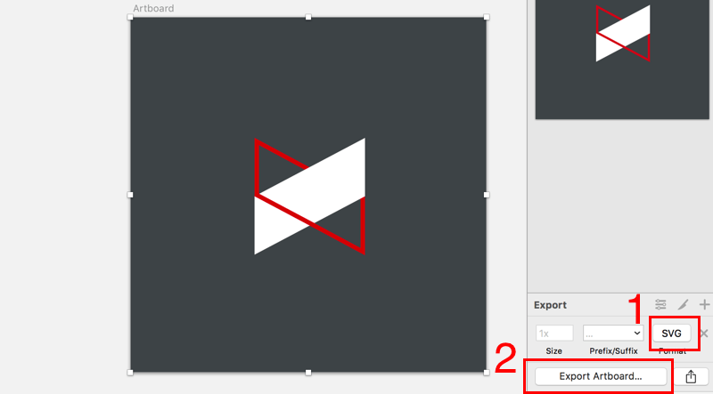
Make sure you have the format set to SVG (1), and then export your file to a location of your choice (2). Remeber where you save it, you'll need to go there in a second and copy the code to a codepen.
Tools and prerequisites
I use Codepen for most of my animations. It's really handy for seeing your code changes straight away. It also makes it easy to include resources like Bootstrap. Including a whole library is a little overkill, but it gets me set up quickly and I'm familiar with it, so for development purposes, it's fine.
The browser I use is Chrome, for the simple fact that it doesn't need any prefixing for the animations to work. We'll need to remember this when we're finished coding though, and run our CSS through an auto-prefixer so everything works ok in other browsers.
Animating the logo with CSS
Getting started with CodePen
You can use the codepen below to get started. Open it up and click "Fork" in the top right of the screen to create your own version of this pen.
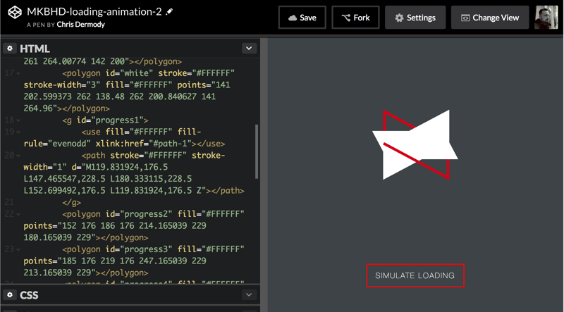
Open up your SVG file in a text editor and copy-paste your SVG code onto the paragraph element in the pen.
See the Pen MKBHD-loading-animation-1 by Chris Dermody (@ChipD) on CodePen.
You should now have something that looks like the below.
Initial CSS to hide the progress bars
First things first, we have the 4 progress bars visible at the moment. We need to hide these.
In the HTML section of the pen, you can see that there are 4 elements with ids progress1, progress2, etc. We can add the following CSS to hide them.
#progress1,
#progress2,
#progress3,
#progress4{
  opacity: 0;
}
Your codepen should now look like the pen below.
See the Pen MKBHD-loading-animation-3 by Chris Dermody (@ChipD) on CodePen.
Initial CSS to rotate the 'redOutline' element
The first part of the animation is to rotate the red element by roughly 28 degrees (remember we found that earlier in Sketch?).
In the CSS panel, add the following rules.
#red {
	transform-origin: 50% 50%;
	transition: 0.25s ease;
}

#red.loading{
	transform: rotate(-27.5deg) translate(-2px,0)
}
Let's walk through the properties here.
transform-origin: 50% 50%; moves the origin of the element to its centre. This sounds complicated, but it just means that when we apply a rotation, it'll rotate about its centre.
transition: 0.25s ease; defines how long a transition applied to this element will take (0.25s, in this case), and then defines the easing. Easings.net is a good resource for visualising the different values that could go here (check browser compatibility though).
transform: rotate(-27.5deg) translate(-2px,0) is what actually does the magic. We're telling it to rotate the element -27.5 degrees (28 was a tad too much), and we're also translating (moving) the element a tiny bit. I had to do this to make it look just right.
The reason we have the transform in a seperate CSS rule is so that we can add and remove the animation with some Javascript, by adding or removing the .loading class.
Some Javascript to make the magic happen
In order to simulate the "loading" state of the animation, we'll add a Javascript function. This function will add the loading class to elements that need it.
At this stage we need to make sure that we have the snapsvg.io library installed. This is essentially jQuery, but for SVG. We can add it to our codepen by clicking the little cog icon beside the JS panel, and adding it via the CDN link:
https://cdnjs.cloudflare.com/ajax/libs/snap.svg/0.5.1/snap.svg-min.js
If you forked the pen I shared earlier, this will already be done for you :)
Add the code onclick="startLoading()" to the button element. This will call the startLoading() function when it's clicked.
Next, we need to define our startLoading() function in the JS panel. This is where we'll add the loading class to the elements that need it. We'll start by selecting the #red element and adding the loading class to it using Snap. I'll also use jQuery to hide the button element.
function startLoading(){

    // hide button
	$('.btn.start').hide();

    // set loading class on elements
    Snap.select("#red").addClass('loading')

}
Click the button to see what adding the loading class to the .redOutline element.
See the Pen MKBHD-loading-animation-4 by Chris Dermody (@ChipD) on CodePen.
We get a simple transition, but it's the start of our animation. Now, let's add some more CSS and JS to really get going.
Next, we need to hide the #redOverlap element when we're 'loading'. In our CSS, add the following code.
#redOverlap {
	transition: 0.25s ease;
}

#redOverlap.loading {
	opacity: 0;
}
This code is basically saying "When the redOverlap element has the class loading, make it invisivle (opacity:0). Also, make it happen over 0.25s with ease easing".
Finally, add an extra line to your JS, to give the redOverlap element the loading class.
function startLoading(){

  // set loading class on elements
  Snap.select("#red").addClass('loading')
  Snap.select("#redOverlap").addClass('loading')

}
Your code should now look like the codepen below. Click the button again to see what happens.
See the Pen MKBHD-loading-animation-5 by Chris Dermody (@ChipD) on CodePen.
Sweet! The red line disappears. Now to take care of the large white block. In my SVG, I've simply named this white. So, like before, we'll add some CSS to animate that element when it has the loading class.
In the CSS panel, add the following.
#white {
	transform-origin: 50% 50%;
	transition: all 0.5s ease;
}

#white.loading {
	transform: scaleX(-1) rotate(27.5deg);
	opacity: 0
}
Let me explain each line of this CSS:
transform-origin: 50% 50%; - We're going to be flipping and rotating the element, this code makes sure that we'll be rotating around the centre of the element by making sure the origin is 50% from the left, and 50% from the top of the element
transition: all 0.5s ease; - This is telling the browser that any animation we add to this element, make it half a second long and use ease easing.
transform: scaleX(-1) rotate(27.5deg); - This is the magic of this animation, and gives the white element the cool "flipping" effect.
scaleX(-1) is what "mirrors" the element along its X axis. Then, at the same time, we're rotating the element 27.5 degrees, so that it appears to fit right into the redoutline element.
opacity: 0 is what makes the element invisible.
Then in our JS, we need to add a line that gives the white element the loading class, to apply the animation when the button is clicked.
function startLoading(){

  // set loading class on elements
    Snap.select("#red").addClass('loading')
	Snap.select("#redOverlap").addClass('loading')
	Snap.select("#white").addClass('loading')

}
And now, you should have a codepen that looks like the one below. Click the simulate loading button to see what our recently added code does.
See the Pen MKBHD-loading-animation-6 by Chris Dermody (@ChipD) on CodePen.
Adding the "progress" steps
We've gotten a lot done! But there's more to do. Now, we need to add the 4 white elements that appear as the "loading" completes. For the purposes of this animation, all I did was add a Javascript function that sequentially reveals the elements in order.
But first, the CSS. Add class="progressBlock"to each progress element in the HTML.
Next, the CSS to reveal the elements. Earlier we added the rule to hide the .progressBlock elements. We'll add another CSS rule under that one that will animate those elements when the loaded class is applied.
.progressBlock {
    opacity: 0;
    transition: 0.25s ease;
}

.progressBlock.loaded {
	opacity: 1;
}
We've used these rules before, you should know them off by now. :)
And finally, the JS to give them the loaded class. For the purpose of the animation, I just created an interval that would run every 500ms and add the loaded class to each element in sequence.
Here's the full JS so far.
let timerId;
let progress;

function startLoading() {
	// set loading class on elements
	Snap.select("#red").addClass("loading");
	Snap.select("#redOverlap").addClass("loading");
	Snap.select("#white").addClass("loading");

	progress = 0;
	timerId = setInterval(frame, 500);


}

function frame() {

	if(progress === 25 ){
		Snap.select("#progress1").addClass('loaded')
	} else if (progress === 50){
		Snap.select("#progress2").addClass('loaded')
	} else if (progress === 75) {
		Snap.select("#progress3").addClass('loaded')
	} else if (progress === 100) {
		Snap.select("#progress4").addClass('loaded')
		clearInterval(timerId);
	}

	progress += 25;

}
You can see that I have 2 global variables, timerId and progress. The frame() function is where the magic happens. It runs every hald a second (500ms), and checks the value of progress. It then reveals the appropriate element by giving it the loaded class we defined earlier.
The effect can be seen in the pen below.
See the Pen MKBHD-loading-animation-7 by Chris Dermody (@ChipD) on CodePen.
It's starting to look pretty good, but we're not finished yet.
We need to add a little more Javascript to remove the loading and loaded classes from all of the elements we just added them to. This will effectively reverse the animations they had earlier.
In the JS pane of your codepen, add the code below.
function finishLoading() {
	// remove loading/loaded classes from all elements
	Snap.select("#red").removeClass("loading");
	Snap.select("#redOverlap").removeClass("loading");
	Snap.select("#white").removeClass("loading");
	Snap.select('#progress1').removeClass('loaded')
	Snap.select('#progress2').removeClass('loaded')
	Snap.select('#progress3').removeClass('loaded')
	Snap.select('#progress4').removeClass('loaded')

	// show button again
	$('.btn.start').show();

}
See what this does in the codepen below.
See the Pen MKBHD-loading-animation-8 by Chris Dermody (@ChipD) on CodePen.
One last thing - cross-browser compatibility
At the start I mentioned how Chrome is the best browser to use for making these animations as it doesn't need any prefixes. But, we need to consider all browsers, or at least as many as we can.
Thankfully, this is fairly quick and easy with online prefixers. My current go-to is autoprefixer.github.io. I just copy-paste the CSS in there, and it adds all the prefixes we need.
And that's it! We've used some fairly simple CSS animations to make an animated loading animation with SVG, with only some Javascript for adding and removing classes as required, and made it all cross-browser compatible.
What did you think of this write-up? I hope I covered everything you came here for. Let me know in the comments below, and if you want to learn more about how I make these animations, make sure you subscribe below.
I'm @cderm on Twitter, or if you'd like to get in touch by email just reply to the welcome email you'll get after you subsribe. I read and reply to all of them.
If you'd like to know how to make this into a GIF, check out my quick post on that here.
