Web developer portfolio template - white desk

In case you haven't been following along, I have my side project mydevportfol.io, which means I keep an eye out for interesting portfolio designs that I could build. While perusing Dribbble, I came across this awesome shot (below), and thought it'd be perfect to turn into a portfolio, so I tried to build it.
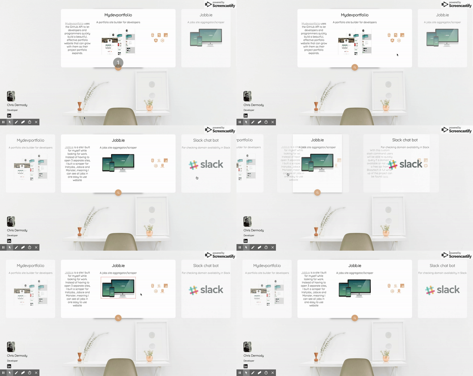
Here's the result

Here's the demo site
What I like about it
It's clean, minimal. I like how it just lets the projects showcase themselves, while not giving too much away.
What I dislike about it
Horizontal scrolling. It's just not that intuitive. I tried getting around this by making the projects clickable, which centres and expands them in the middle of the screen (except on Firefox because they're assholes).
What do you think?
Let me know :)
