How to generate different device frames in Chrome to show off responsive websites and apps

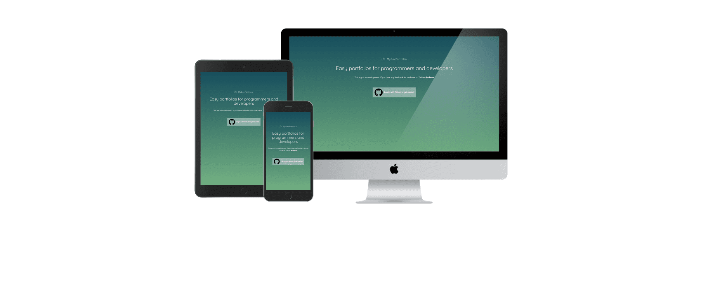
If you've been following the blog, you'll know that I've been busy building portfolio templates for developers and programmers for the last few months. If you haven't, you can check them out here and here. I've been sharing them on Reddit and getting some fanastic feedback, and one of the questions I repeatedly get asked is where I get the device frames and images for my templates. In this post, I want to share how I generate (most) of them using the Chrome dev tools.
Making sure recruiters and prospective clients know that you can build and/or design responsive websites is essential for any modern web developer, and just including skills like "Bootstrap" won't cut it. Our readers aren't always tech-savvy, so we have to spell it out for them, and a picture says a thousand words, as they say.
Device Frames In Chrome Dev Tools
For mobile and tablet devices, Chrome dev tools is my go to for generating images that show my projects in all their responsive glory. Here's how it's done.
1. Navigate to your website in the chrome browser.
For this example I'll be using my latest side project, mydevportfol.io
2. Open up Chrome dev tools
I like my keyboard shortcuts, so using CMD+ALT+J on Mac, and CTRL+SHIFT+J on Windows will open up the dev tools window.
3. Toggle the device toolbar

The device toolbar is where the magic happens. Open it by clicking on the icon in the image above, or use CMD+SHIFT+M to open it on Mac, or CTRL+SHIFT+M on Windows.
4. Click "Show Device Frame" from top-right menu

We need to make sure this is enabled so that Chrome shows us the device frame wrapped around our responsive site. I find it's a great tool for general development as it helps get a sense of scale regarding the UI.
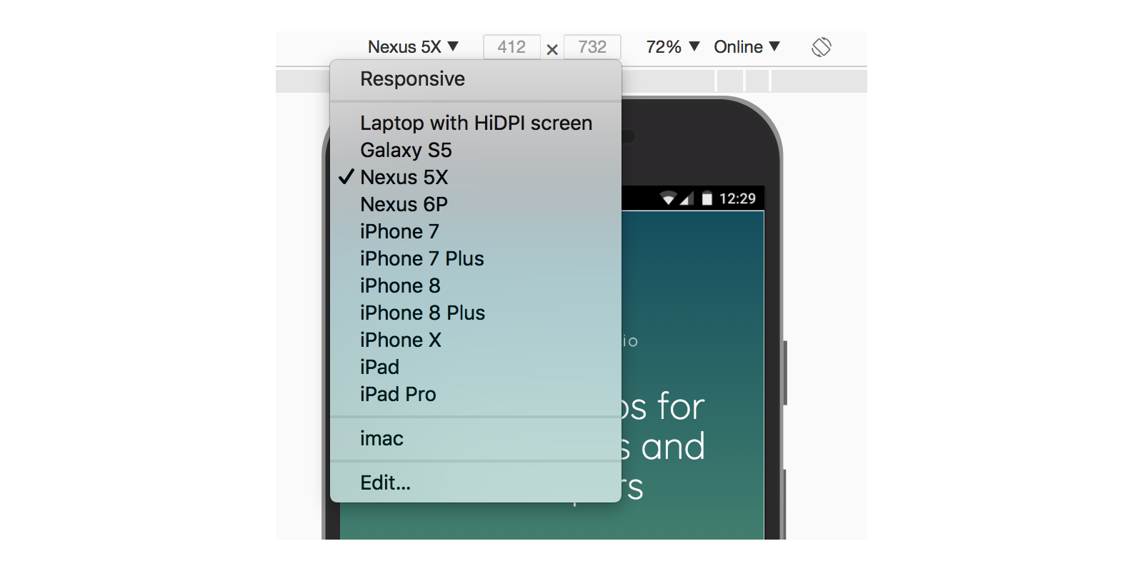
5. Select the desired device from the dropdown menu

When you first open the device toolbar, it'll likely be set on "responsive". We can change this from the drop-down menu, selecting from a range of devices from both Android and Apple.
At time of writing this blog, some device frames aren't available, such as the iPhone X, but they'll come in an upcoming Chrome update.
6. Let Chrome take your screenshot

Chrome has a feature where it can take a screenshot of your current page, which will include the device's frame. Pretty frickin cool.

What about the iMac?
The above technique will work for generating screenshots with Android and Apple mobile device frames, as well as Apple's iPad. However, we can't (yet) generate one for laptop or desktop devices. For this, we'll need to employ some photo editing skills. Sketch is my go-to for these things, but feel free to use Photoshop if you have it and can use it, or GIMP (a free alternative).
Photoshop/Sketch method
We can use the technique I described above to generate screenshots of any resolution our heart desires. So in the case of the iMac, let's use 1920x1280 (I know that fits the frame below). Set the mode back to "responsive" in the device toolbar, and input the resolution.

This resolution will give you the right aspect ratio to fit nicely into the iMac device frame below. Some Photoshop or Sketch work will be required of course, and don't forget to compress the result.

Did I miss anything? Was there something you came here for that I didn't address? Let me know on Twitter @cderm. ;)
