Web Developer Portfolios - free templates for developers and programmers to show off their work with GitHub pages
In this post I discuss three free templates I created for developers and programmers to use to show off their skills and impress recruiters

A while back, I commented on a reddit post where OP was asking about when you felt “ready” for your first developer job. I described how I didn’t feel ready, but desperate. In that desperation I built a quick web developer portfolio page to show off my projects. It was necessarily minimal due to time restrictions, but it did the job, and actually landed me in my first web developer job.
I received a lot of very positive comments and messages about the page, which sort of surprised me. I liked it, but didn’t think it was amazing. Looking at it now, however, I can see that the minimal approach meant that the projects themselves could stand out and really sell my skills as a developer. It reminded me that just because someone can build a website, doesn’t mean they can *design *a website. So, I had an idea. What if there was a web app that used the GitHub API to auto-generate a 1-page site that developers and programmers could use.
I liked the idea, but I wanted to test it before I started to build it. I posted on Reddit again, offering my services. If someone sent me the info I needed (github link, projects info, profile pic etc), I’d build them a webpage. In return, they had to tell me what they liked and disliked about such a service, and how much they’d be willing to pay. This isn’t *perfect *as a method for validation. Nobody was handing over money, which is the real litmus test. But I liked the approach since it’d show me what roadblocks I might run into, and give me more ideas. Also, I could test out my web designs skills.
As of time of writing this post, I’m working on an MVP that could do this automatically, but for this experiment I’d be coding the sites myself.
Below are some of the designs and layouts I came up with.
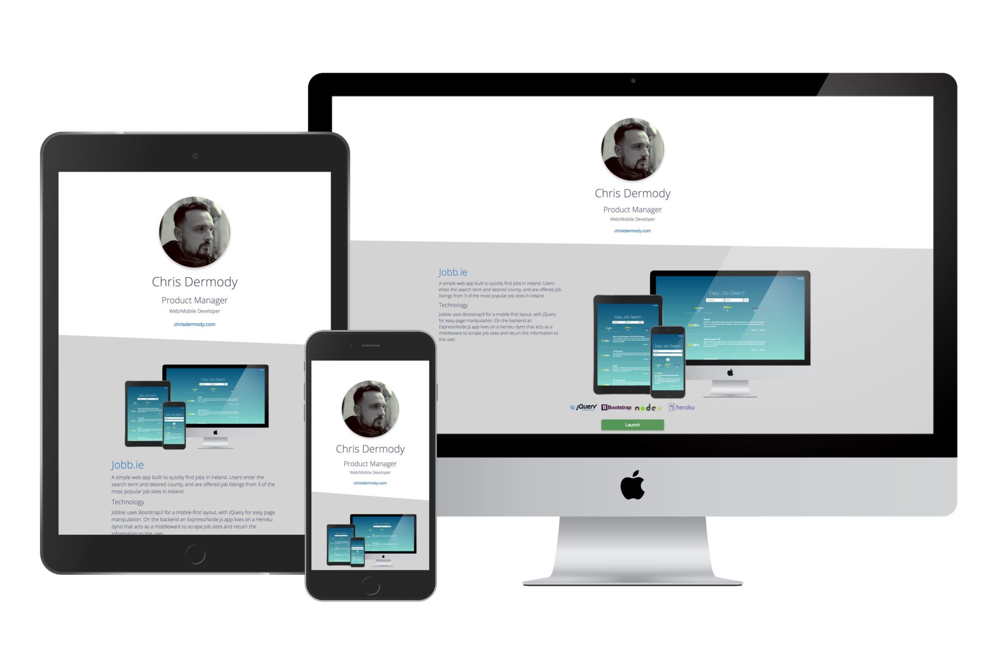
Web Portfolio Template 1 – “Angled”

This is the design that got me my first job as a professional web developer. I use the clip-path to create an angled effect for the divs, which sort of encourages the reader to scroll, where horizontal lines would be a little “harder” visually.
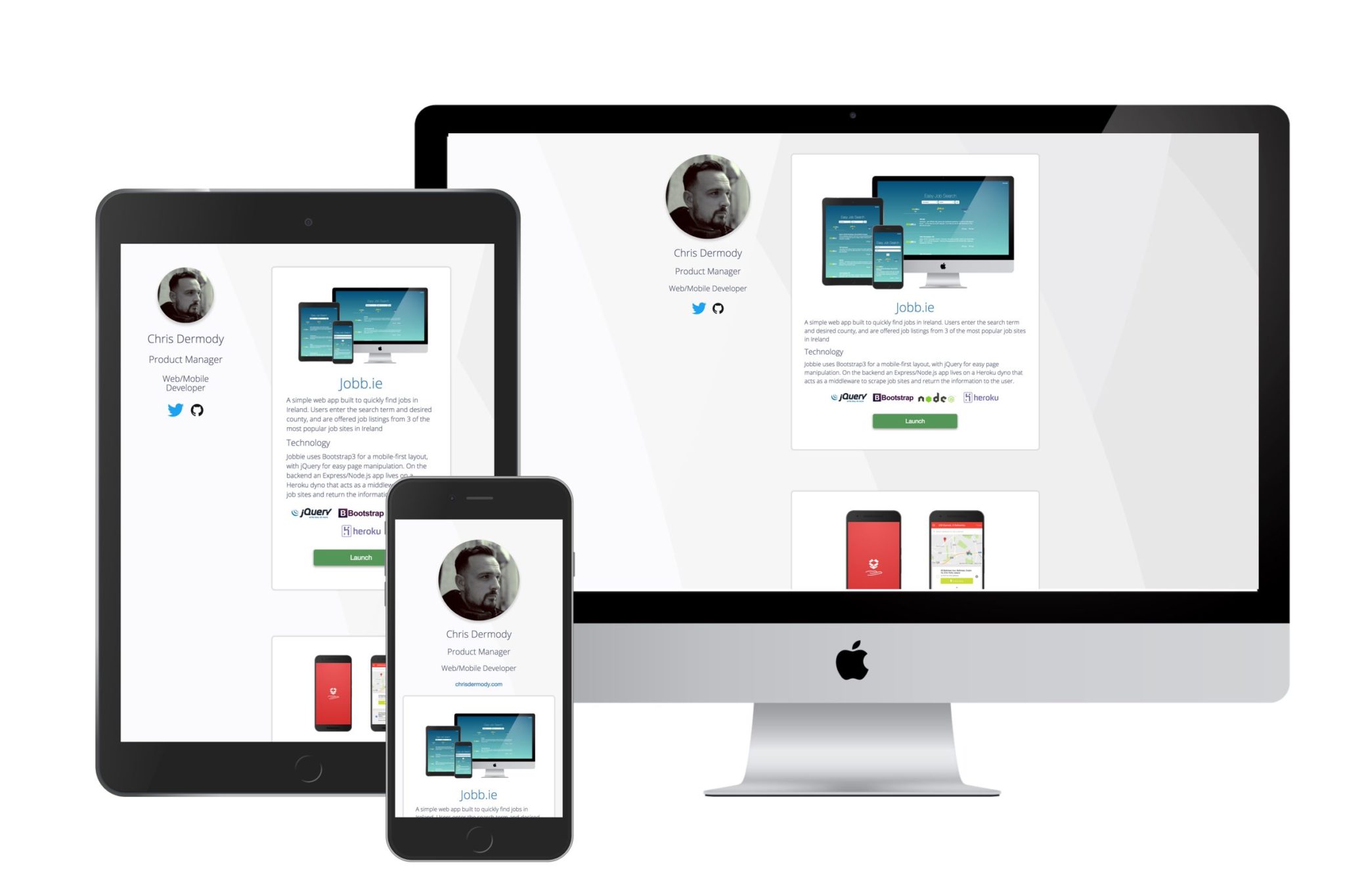
Web Portfolio Template 2 – “Triangles”

This site is similar in its simplicity to “Angled”, but has some key differences that make it my favorite so far.
The “About” section is fixed (on tablet and above), which means the user can scroll through the projects etc, but will always be able to see the contact icons on the left hand side of the screen.
For mobile, I added a fixed element to the bottom of the page that only shows when the user scrolls to a point where the “About” section is no longer visible.
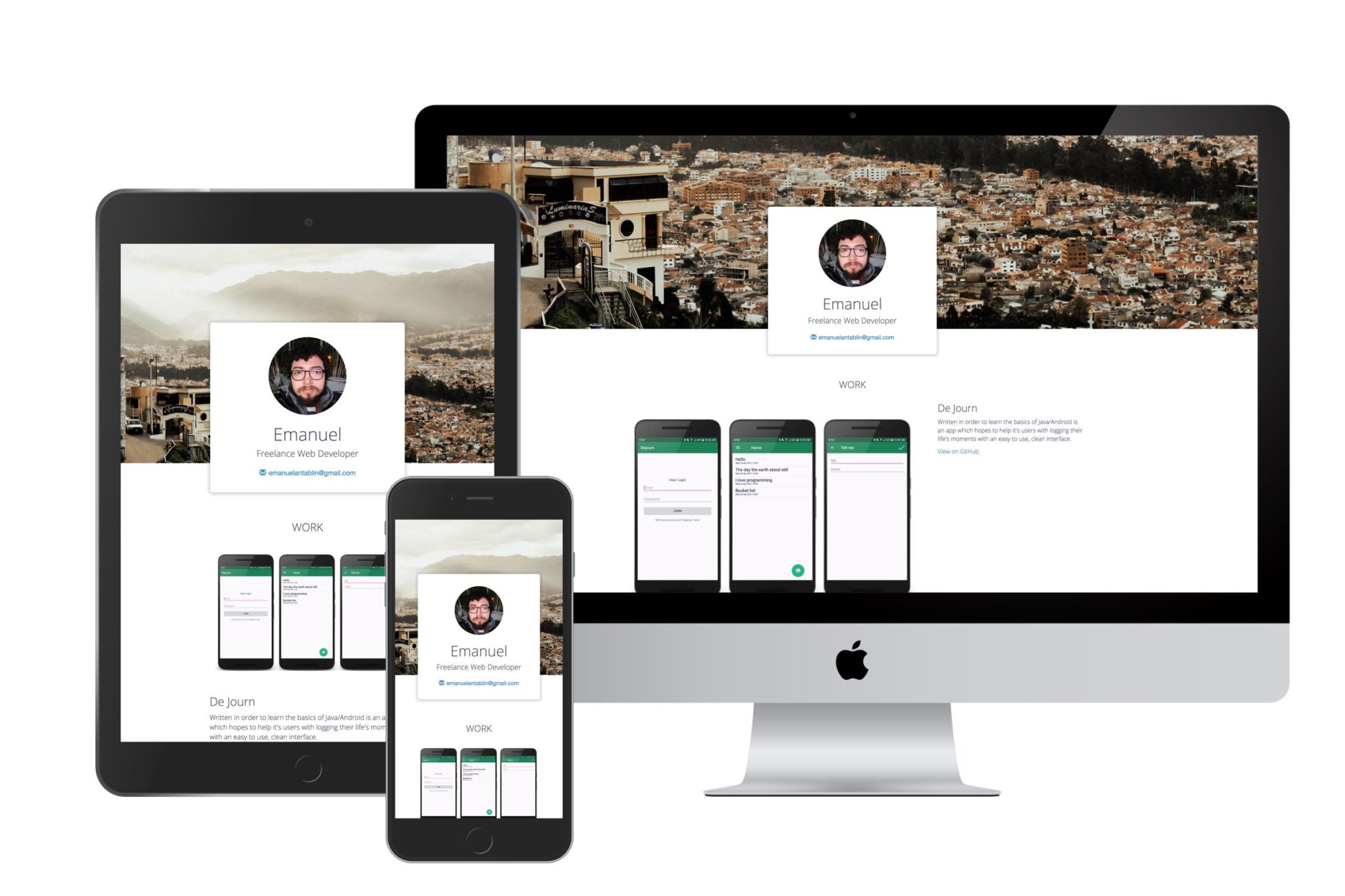
Web Portfolio Template 3 – “Modern”

”Modern” is a design I built around a redditor’s response to my request for test subjects. It’s also the first template I built that uses the fantastic devicons project, of which I’m now an occasional contributor.
I wanted to add a little imagery to it, so the idea here would be that the images at the top and bottom of the page were from the city/area/country that the developer is from. In this case, it’s Brazil.
I quite like this layout, I feel like it’s a welcome departure from the clinical, minimal designs of Angled and Triangles.
Moving Forward
During nights and weekends I’m coding the web app that’ll do this automatically, pulling the data from the GitHub API, and populating a landing page for users to host on their GitHub pages profile. Subscribe below for updates, follow my progress on Twitter and don’t be afraid to let me know in the comments what you think of the designs so far!
